UX / Interaction Design · 2024
Athlyst.
Collect. Trade. Connect.
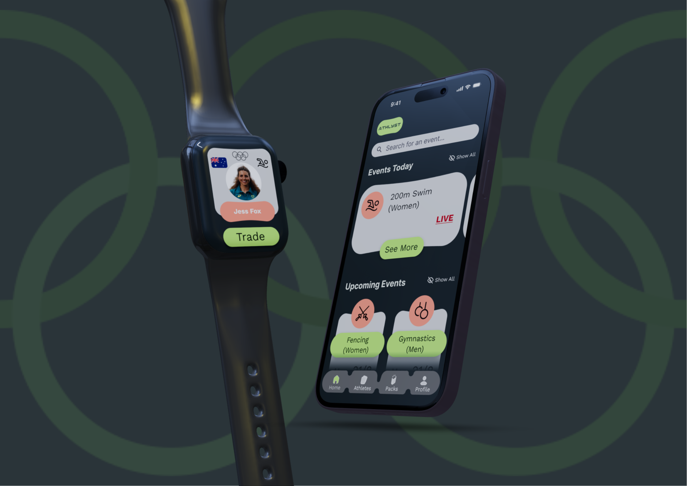
A gamified Olympic engagement app that connects viewers with athletes through tradeable cards, personal storytelling, and live event discovery.
Figma
User Research
Prototyping
Usability Testing
Heuristic Evaluation
UX Writing
The Brief
Designing for lifestyle, leisure & entertainment
Our studio brief asked us to investigate and develop a digital design solution within the lifestyle, leisure, and entertainment space of the Olympic Games.
As a team, we noticed a consistent gap in how viewers engaged with the Olympics, people only followed the sports they already knew, and the athletes outside of those big events rarely got a look in. We wanted to fix that.
The Team
Three people, one project
Each of us owned a clear area while staying across everything else, research, design, and aesthetics were shared responsibilities even when primary leads differed.
AT
Amorino Toongart
UX & Aesthetics Lead
That's me ✦
LC
Lachlan Callender
Writing & Research Lead
TA
Tyler Abrahams
Figma & UI Design Lead
The Problem
Viewers want connection.
Algorithms keep delivering the same three sports.
Research showed that viewers consistently reported wanting deeper engagement with Olympic athletes, yet existing platforms only surfaced high-profile events and already-famous names.
Streaming algorithms are designed to maximise viewership, not discovery. Authentic stories from lesser-known athletes and sports rarely made it through. Even when viewers were curious, there was no intuitive, low-effort way to explore what they were missing.
"To explore how context and storytelling can be seamlessly integrated to enhance the viewing experience of the Olympics, making it more inclusive, accessible, and genuinely engaging for a wider audience."
The Solution
Athlyst — like Pokémon,
but for Olympic athletes
Athlyst is a gamified card collection app where viewers earn athlete cards by watching Olympic events, entering broadcast codes, and completing in-app challenges.
Each card goes deep on who the athlete actually is: where they're from, what drives them, what their sport feels like to watch. Cards can be traded with friends through a tap on phone or Apple Watch, making the whole thing social.
"Athlyst gives viewers a reason to care about the athlete before the race even starts."
💡
Live prototype below, click through the screens just like you would on a real phone
The Demo
See it in motion
A walkthrough of the final Athlyst prototype, from pack opening to trading, friend profiles, and the home page sports discovery flow.
Key Features
What Athlyst actually does
01
Home Page
Live and upcoming Olympic events are surfaced in one place, with tappable sport breakdowns explaining rules, strategies, and schedules, giving viewers context before they watch.
02
Athlete Cards
Each card centres the athlete's personal story: what got them here, where they came from, what their sport actually is. Lesser-known athletes get the same spotlight as the household names.
03
Pack Opening
Users watch a live Olympic event, enter a broadcast code, and unlock a themed athlete pack, with slide-to-unlock animations and confetti providing satisfying feedback.
04
Trading
Athletes can be traded with friends via a tap interaction on phone or Apple Watch, enabling face-to-face social exchanges and completing each other's collections collaboratively.
05
Friends
Users can add friends via unique codes, see which athletes they have collected and favourited, and stay connected around what the Olympics means to them socially.
How We Got There
Low-fi to high-fi,
tested at every step
Every design decision was grounded in research and tested with real participants, from two initial pilot tests all the way through to a final round of expert heuristic evaluations.
01
Concept Development
Research & Ideation
Surveys, interviews, and focus groups with 5 participants informed three user personas. Mashup and Crazy 8s ideation led to three distinct concepts evaluated against a structured decision matrix.
Interviews
Personas
Decision matrix
02
Structural Design
Low & Mid Fidelity
Seven participants tested the lo-fi prototype via think-aloud tasks and SUS surveys (66.5). Mid-fidelity addressed navigation, iconography, and trade flow issues, improving SUS to 70.8.
Think-aloud
SUS survey
Nav overhaul
03
Final Polish
Heuristic Eval & Hi-Fi
Six UX expert evaluators used Nielsen's ten heuristics to audit the high-fidelity prototype, followed by four user tests. All severity ratings dropped after refinements were implemented.
Heuristic eval
Expert review
Final prototype
Testing Session Evidence
📸
Participants using prototype
📋
SUS survey / affinity notes
Lo-fi to Hi-fi
🖼️
Low-fidelity wireframes
🖼️
Final high-fidelity screens
Key Insights from Testing
On Navigation
The globe icon for the athletes tab was consistently misread as a browser or network button, taking users an average of 39 seconds to find. We redesigned it entirely.
On Trading
Users wanted to know which card they were trading before confirming. Moving trade initiation to the athlete card itself solved the ambiguity completely.
On Trust Signals
A tutorial modal on the pack page dramatically reduced confusion, users told us it covered everything they needed without feeling patronising.
On Profile Clarity
Differentiating the user's own profile from a friend's profile was the biggest heuristic violation flagged by experts, fixed with distinct headings and visual separation.
My Role
UX & Aesthetics Lead
My focus spanned the full design process, from shaping how we framed the research problem through to overseeing the visual coherence of the final prototype.
Led UX research direction: helped shape interview questions, conduct participant sessions, and synthesise findings from surveys and think-aloud tests into actionable design decisions
Owned aesthetic oversight: maintained visual consistency across all prototype iterations, establishing the colour system, component language, and overall design feel
Contributed to ideation and concept development: participated in Mashup and Crazy 8s sessions, co-developed the three final concepts, and helped evaluate them against the decision matrix
Ran and analysed usability testing: facilitated think-aloud sessions, collected and transcribed data, and used Usability Insights Tables to map findings into design iterations
Contributed to Figma prototyping: worked alongside Tyler on screen design, component variants, and the interactive wireflows across phone and Apple Watch modalities
📸
Photo at user testing or working on the project
What Worked
The sequential testing strategy, experts first, then users, meant we caught fundamental issues early and arrived at final testing with only cosmetic problems left. The improvement in SUS scores validated every iteration.
What I Would Change
I would have pushed for more participants in the mid-fidelity stage. Four testers gave us good signal but a broader sample would have surfaced the profile differentiation issue sooner, before the heuristic evaluation stage.
What It Taught Me
The concept that scores highest on a decision matrix is not always the easiest to build well. Gamification raises the bar for clarity and feedback, every interaction has to feel earned, not arbitrary.