Data Visualisation · UX Design · 2025
Data that helps you breathe easier at work.
An interactive IEQ dashboard that turns raw building sensor data into instant, actionable insight, giving office managers a clear picture of their workspace health before problems become complaints.
JavaScript
Plotly.js
Data Analysis
UX Design
Usability Testing
Information Design
The Brief
Designing for data that already exists
The brief was deliberately open-ended: given a year's worth of real IEQ sensor data from the University of Sydney's SAMBA system, what data visualisation product could it enable?
SAMBA captures 10 comfort metrics (temperature, CO₂, airspeed, humidity, light, sound, and more) every five minutes, across three office zones, for an entire year. The data was rich. The opportunity was clear. But nobody was actually reading it in a useful way.
I noticed that at industry events I'd attended, environmental conditions in workspaces were barely considered. If we expect people to do their best work, the spaces they occupy need to support that. That observation shaped everything from the problem statement to the final interface.
The Problem
Managers can't fix what they
can't see
The SAMBA system was collecting data constantly. But without a clear way to interpret it, office managers had no choice but to wait, until a staff member complained, until conditions were already uncomfortable, until the problem was too big to ignore.
Poor ventilation doesn't just cause discomfort. It leads to increased sick leave, lower productivity, and expensive emergency maintenance. The gap wasn't the data. It was the interface.
"Although the IEQ Lab's SAMBA system continuously captures airflow, CO₂, and other comfort metrics every five minutes across all office zones, without clear, easy-to-digest visualisations, office managers can't detect under-ventilated areas until staff complain. By which time the problem has persisted, causing discomfort, health risks, and expensive emergency interventions."
The Solution
Breath of Fresh Air — data at a glance
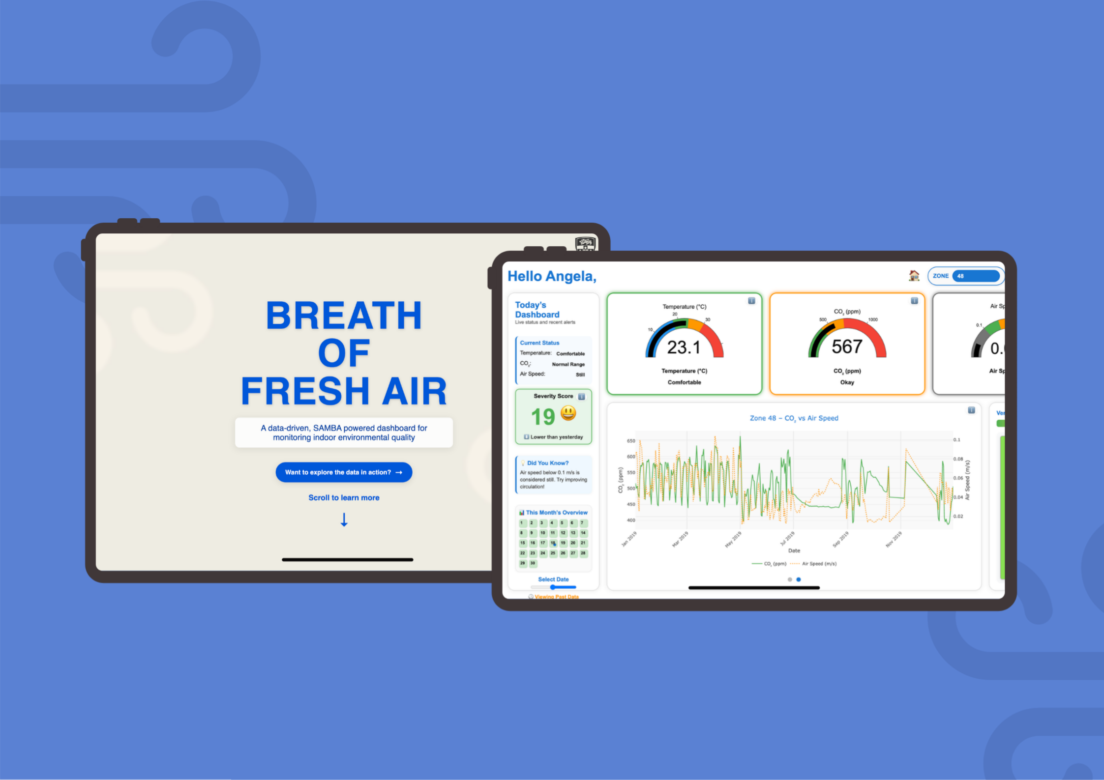
An interactive, single-screen dashboard that turns a year's worth of raw sensor readings into something any office manager can understand in seconds, no data background required.
Inspired by the immediate legibility of fire danger rating signs and the familiarity of traffic-light colour systems, the interface uses large colour-coded gauges, a severity score, a zone map, and a monthly calendar view to give a complete picture of workspace health, all without a single menu to dig through.
"Healthier Space + Action = Better Results. That was the equation driving every design decision."
🖥️
Final dashboard screenshot, replace with assets/bofa-dashboard.jpg
Key Features
What the dashboard actually does
01
Colour-Coded Gauges
Large, instantly readable gauges for temperature, CO₂, and airspeed, each with a labelled severity state like "Comfortable", "Okay", or "Drafty" displayed below. No guessing what the number means.
02
Severity Score
A single weighted composite score (0–100) that aggregates all three key variables into one number. Colour-coded and paired with an emoji indicator, green face for good, concerned face for poor. Updates with the selected date.
03
Zone Map
A spatial overview of Zones 48, 49, and 50 with ventilation satisfaction percentages displayed in colour. Moved to the main screen after feedback, lets managers immediately see which zone needs attention.
04
Dual-Axis Graph Carousel
Explore relationships between variables over time, CO₂ vs Airspeed, Temperature vs PMV, using Plotly.js dual-axis charts. A carousel format keeps the layout clean without hiding the depth.
05
Monthly Calendar & Date Slider
Navigate across the full year of data using a date slider or clickable calendar. Each day's severity score is visible at a glance, making it easy to spot patterns and anomalies without running a query.
06
Today's Dashboard Panel
A status summary sidebar listing current conditions for each metric and a "Did You Know?" tip about ventilation. Contextualises the data for non-technical users and provides a nudge to take action.
How I Got There
From raw CSV to polished
interactive dashboard
Every design decision was evidence-based, from the choice to use large fonts (backed by Rello et al., 2016) to the traffic-light colour system inspired by fire danger rating signs.
01
Data & Concept (A1)
Analysis & Low-Fidelity
Analysed Zones 48, 49, and 50 to identify patterns. Found a clear inverse relationship between CO₂ and airspeed, and a link between temperature and PMV. Sketched dashboard concepts and presented findings.
SAMBA data
Tableau
Sketching
02
Build & Test (A2 Early)
Prototype & Round 1 Testing
Built a working HTML/JS dashboard using Plotly.js. Tested with 3 design students. Feedback flagged missing context around gauge thresholds. Redesigned the status panel, gauge labels, and map layout in response.
Plotly.js
HTML/CSS/JS
Think-aloud
03
Final Polish (A2 Final)
10-Person Test & Final Build
Second round with 10 participants across non-design adults, design students, and an industry designer. Added tooltips, "i" icons, emoji severity indicators, and improved spacing. Final dashboard was clear and actionable for all groups.
10 participants
Tooltips
Final polish
Usability Testing Participants
📸
Non-design student testing
📸
Design background student
📸
Adult participant (office manager)
Sketches to Final Dashboard
✏️
Early gauge & zone sketches
Key Insights from Testing
On Gauge Readability
Large numbers and colour were understood immediately by all groups, including non-design adults. But without labelled thresholds, users couldn't judge if a value was "bad" or not.
On Context
Adding plain-English labels ("Comfortable", "Drafty") below each gauge resolved almost all confusion. Showing what the number means matters more than showing the number alone.
On the Map
Moving the zone map to the main screen was one of the most impactful changes, users no longer had to navigate to see which zone needed attention. Spatial context is critical for building data.
On Cognitive Load
Single-screen layout consistently reduced anxiety. Users across all groups said it felt "manageable", a deliberate outcome of the design to avoid overwhelming non-technical audiences.
My Role
Solo, Design, Data & Development
This was a solo project end-to-end. I owned everything from the initial data analysis through to the final coded, interactive dashboard.
Data analysis and pattern identification: processed a full year of SAMBA sensor readings across Zones 48, 49, and 50, identifying key relationships between CO₂, airspeed, temperature, and PMV that shaped the dashboard's focus variables
UX research and problem framing: defined the target audience (non-technical office managers), shaped the problem statement, and grounded every design decision in research on readability, accessibility, and environmental data communication
Interactive dashboard development: built the full working dashboard in HTML, CSS, and JavaScript using Plotly.js for gauge and graph rendering, including the severity score normalisation logic and date-based data filtering
Designed and ran two rounds of usability testing: recruited and facilitated testing with 13 participants across two phases, synthesised findings, and iterated the design in direct response to what users struggled with
Information design and visual hierarchy: applied research-backed choices (large fonts, traffic-light colours, single-screen layout) to make complex sensor data immediately interpretable for non-expert users
What Worked
The single-screen constraint was the right call. Users consistently found it less overwhelming than multi-page dashboards. The plain-English gauge labels were the single biggest comprehension improvement across the whole project.
What I Would Change
I would test with actual building facilities managers earlier. Stand-in participants gave useful signal but real office managers have domain knowledge you can't replicate, and understanding that earlier would have shaped the whole information architecture.
What It Taught Me
Data visualisation is a communication problem first. The hardest part was figuring out what to hide, not how to build the charts. Constraints are design tools.