UX / Interaction Design · 2025
 Roamy.
Where are we roaming next?
A cultural discovery app connecting young Australian travellers with authentic, local-hosted experiences across Asia.
Figma
User Research
Prototyping
Usability Testing
Interaction Design
UX Writing
The Brief
Designing for transitions
Our studio brief was intentionally broad: design for a moment of transition. Among every direction we explored, travel stood out as the most personal and the most underserved.
As a team with backgrounds spanning Japan, Thailand, the Philippines, and Indonesia, we had all experienced the gap between wanting a genuine cultural experience and ending up in a tourist trap. That shared frustration became the starting point.
The Team
We worked like a real design team
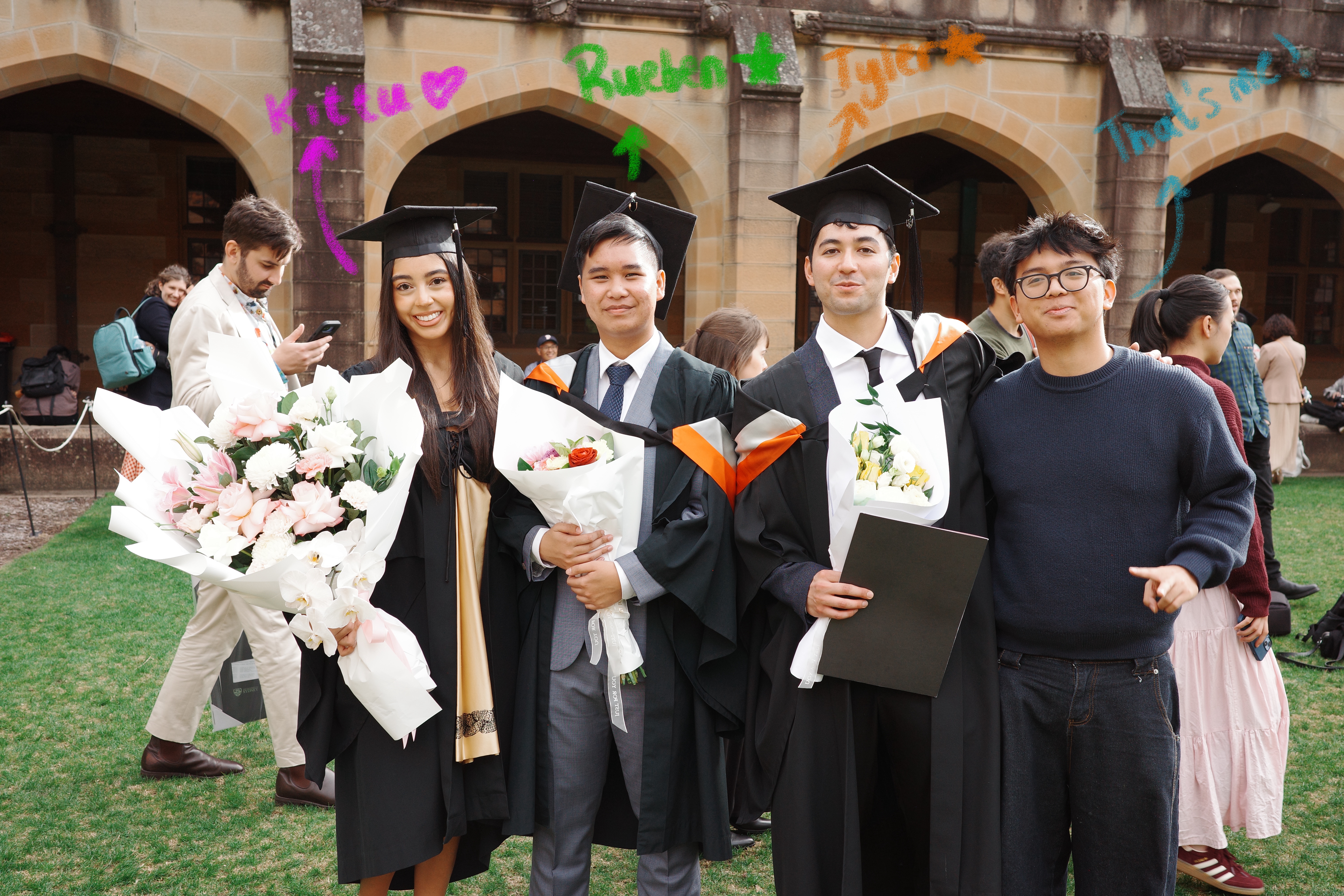
Four of us, four roles, one project, each person owning a clear area while staying across everything else. We set our own timeline, ran our own meetings, and held each other accountable.
AT
Amorino Toongart
UX Design & Ideation
That's me ✦
TA
Tyler Abraham
Lead UI Designer
KH
Kittu Hoyne
Branding & Testing
RS
Ruben Suwargo
Research & Docs
The Problem
Young travellers want real culture.
They keep finding tourist traps.
58% of Australians aged 18 to 25 were planning overseas trips in 2024, with Asia-Pacific as their top destination.
They want something genuine: local food stalls, language lessons, real conversations. The tools to find those experiences just did not exist. Without them, people end up on the same guided bus tour as everyone else, and the local community sees little economic benefit from their visit.
"Young Australians seek authentic, culturally rich experiences, yet face barriers in awareness, planning, and cultural understanding. Without effective models, many are funnelled into tourist traps, leading to diluted experiences for them and missed economic opportunities for local communities."
The Solution
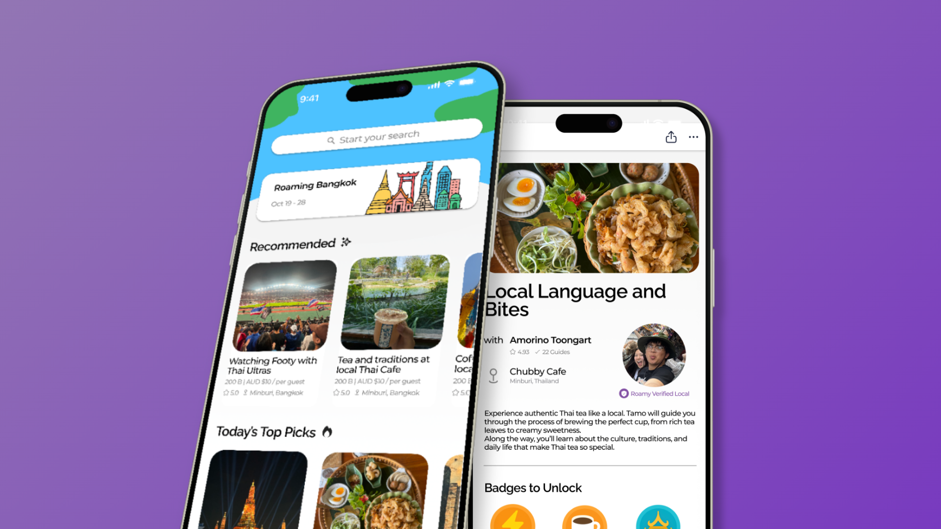
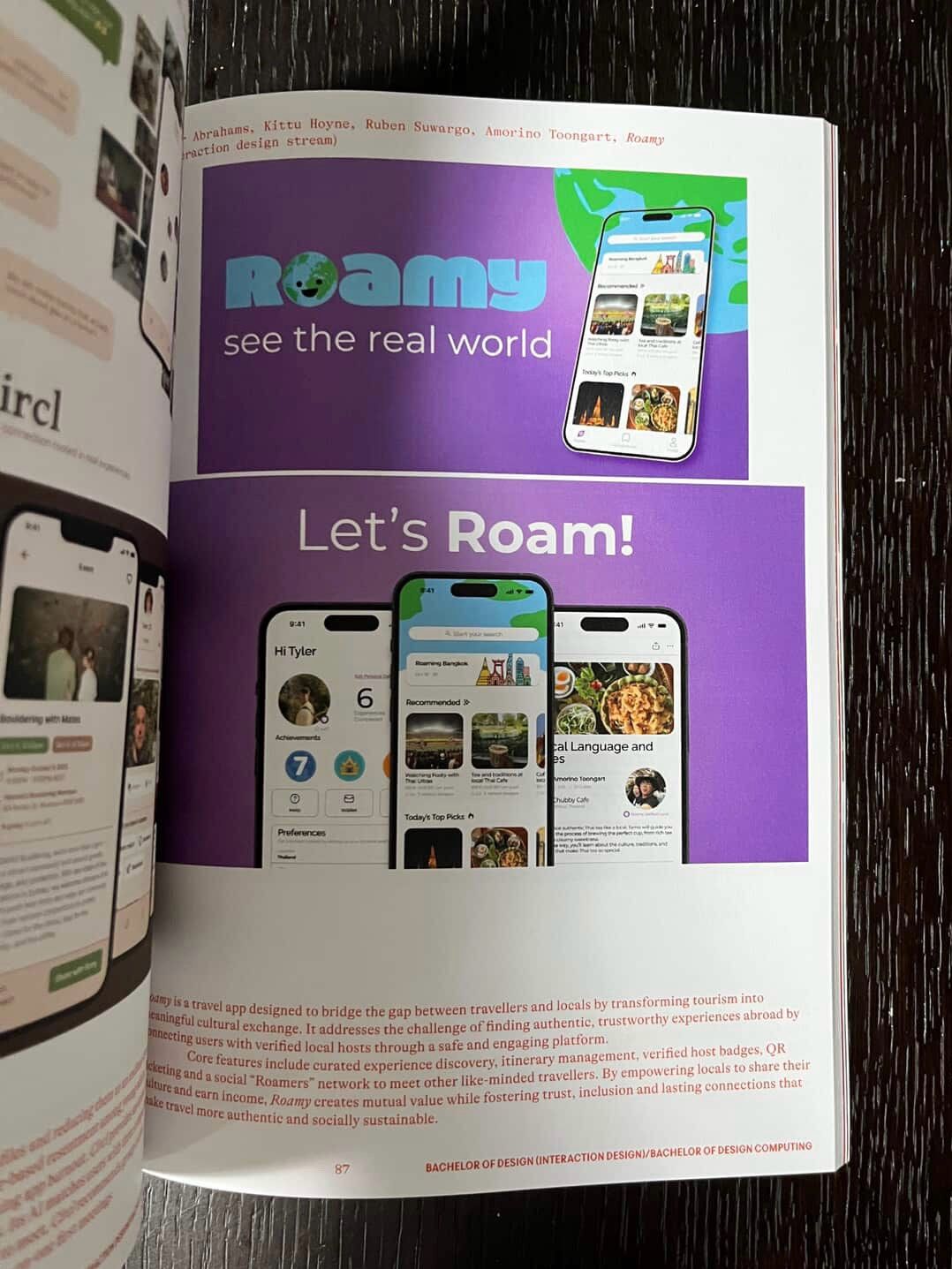
Roamy — like having a friend in town
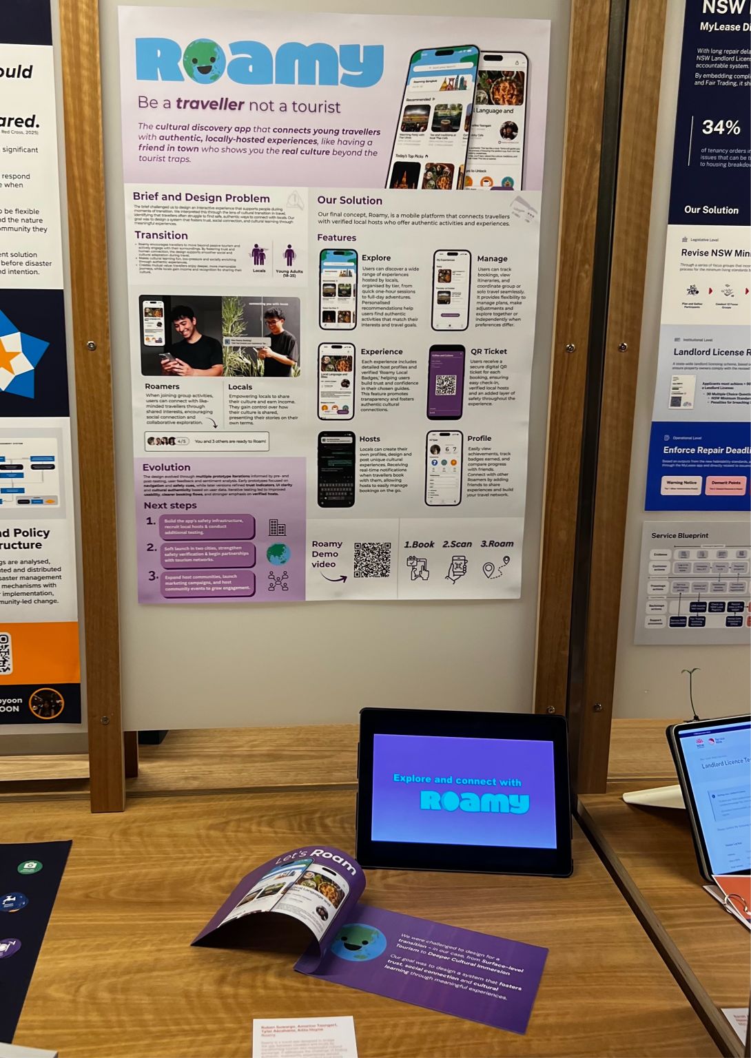
Roamy connects travellers directly with verified locals who host experiences. A Thai tea ceremony. A cooking class from someone's grandmother's kitchen. A street food walk through a neighbourhood no travel blog covers.
It creates genuine value on both sides: travellers get real cultural access, locals earn income and get recognised for sharing what they know best.
"The best moment isn't the booking. It's what happens when two people who'd never otherwise cross paths actually do."
💡
Live prototype below, click through the screens just like you would on a real phone
The Ad
We made an ad for it too
Part of the brief was bringing Roamy to life beyond the prototype, so we produced a short video ad to capture what the experience actually feels like.
Key Features
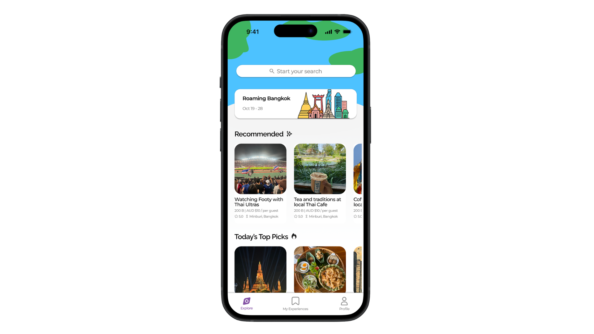
What Roamy actually does
01
Explore
Users are able to browse unique experiences hosted by locals, organised by tier, from short one-hour activities to full-day adventures.
02
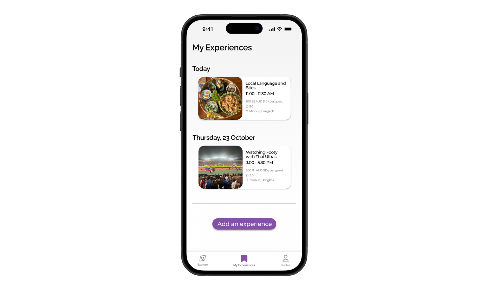
Manage
Users can track bookings, view itineraries, and coordinate group or solo travel, giving travellers the flexibility to explore together or meet new buddies along the way.
03
Experience
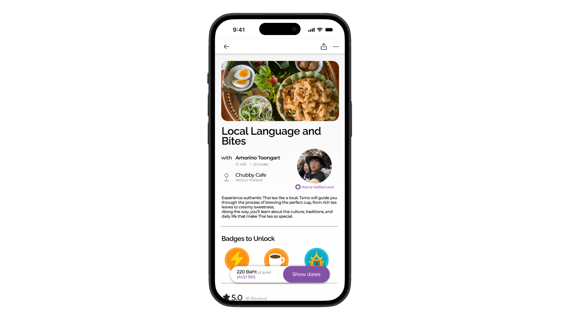
Users are provided with information about their local hosts through a Roamy Verified Local Badge, building genuine trust and security before they arrive.
04
Locals
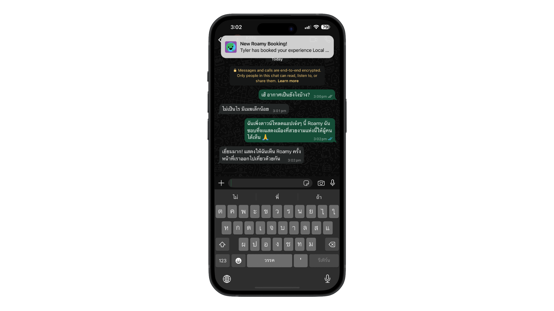
Empowering locals to share their culture and earn income by hosting verified experiences, with real-time notifications when travellers book with them.
05
QR Ticket
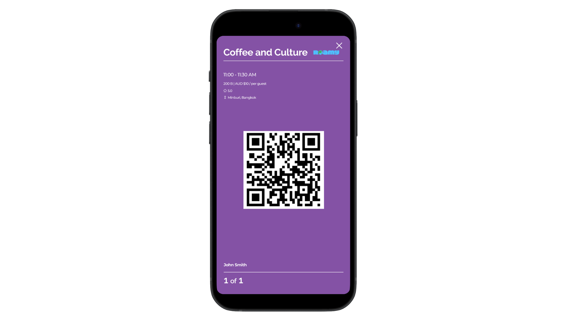
Users are provided with QR codes to ensure security and verification with locals, bringing safety and confidence to every experience.
How We Got There
Three rounds of testing,
each one sharper
Every design decision came from something we heard, observed, or tested, starting from a pantomime in a classroom and ending at a polished, animated prototype.
01
Concept Testing
Pantomime & Low-Fidelity
Simulated a Thai café cultural exchange with 7 participants. Before any screens, we put people inside the experience to test whether the concept resonated emotionally.
Think-aloud
Likert survey
Wireframes
02
Structural Design
Mid-Fidelity Prototype
Built in Figma with consistent components, real imagery, and colour. Drew from Airbnb, Headspace, and Booking.com to shape familiar-feeling but culturally distinct patterns.
Simplified ticket
Trust signals
Nav overhaul
03
Final Polish
High-Fidelity & Brand
Finalised the logo, globe in the O, colour system, onboarding animation, and resolved all UI inconsistencies. Playful and modern without losing credibility.
Onboarding anim
Brand locked
Final prototype
Testing Session Evidence
📸
Participants using prototype
📋
Affinity map / survey data
Lo-fi to Hi-fi
🖼️
Final high-fidelity screens
Key Insights from Testing
On Trust
Verified badges raised confidence, but without context, nobody knew what they meant. We added explanation to every trust signal.
On Navigation
Users wanted clearer transitions between browsing, booking, and managing. We rebuilt the flow so each state felt distinct.
On Cultural Framing
People engaged more with activities framed as cultural exchange. The language mattered as much as the features.
On the Ticket Screen
The original check-in was too cluttered. Stripping it to a QR code and essential info dramatically improved confidence.
My Role
UX Designer & Ideation Lead
I was hands-on across the full project, from the first research conversations through to the final prototype screens in Figma.
Wireframing and prototyping in Figma: owned the product from low-fidelity sketches all the way through to the final interactive high-fidelity prototype across both traveller and host sides
Led ideation and UX research direction: shaped the problem framing, defined our user personas, and drove the research approach that grounded every design decision
Designed and ran usability testing: facilitated the pantomime scenario, analysed Likert-scale survey results, and synthesised findings into actionable iterations
Information architecture and interaction design: mapped the full user flow, defining how every screen connected and how the experience felt to move through
Contributed to visual and brand design: worked alongside Kittu on the UI system, component library, and visual consistency across all screens
What Worked
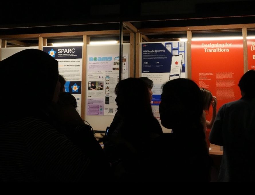
Clear roles and a shared Figma workspace kept things moving. The user testing fair was the highlight. Watching real people want to use something we built confirmed we had the right idea.
What I Would Change
I would push the local host perspective harder earlier on. Our design skewed traveller-first. Testing more scenario variations sooner would have given us stronger signal.
What It Taught Me
Design shapes feelings as much as functionality. Iteration is the process. The work gets better when you genuinely care about what you are solving for.